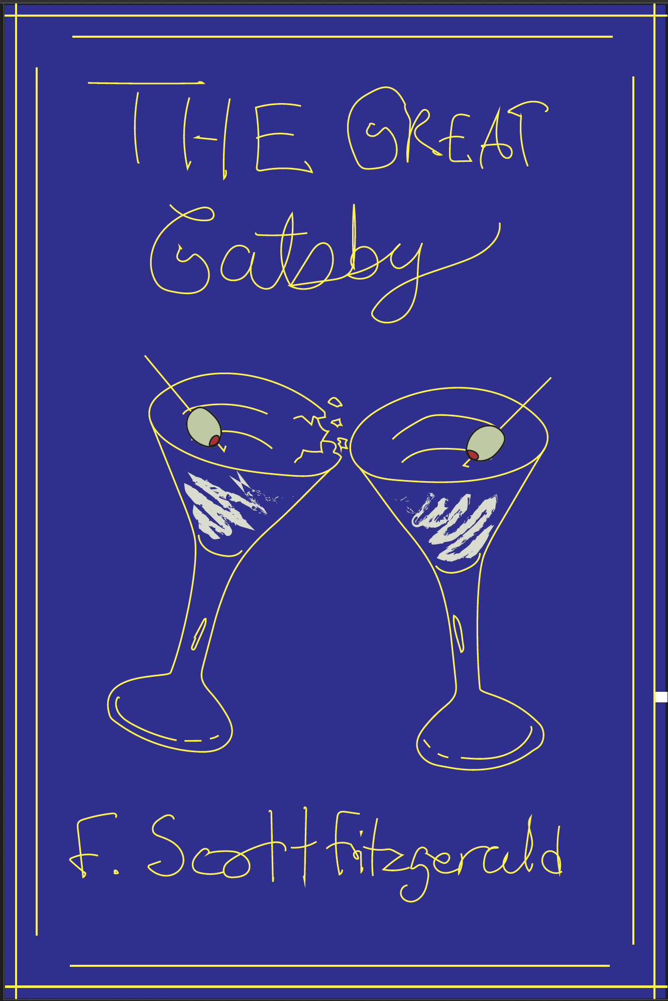
The Great Gatsby Novel
Illustration Design • Indesign, IllustratorThis is an illustrated redesign of the classic novel The Great Gatsby, written by F. Scott Fitzgerald. The cover incorporates symbolic elements from the story that subtlety foreshadows the friendship between Nick Carraway and Jay Gatsby. The history behind the act of making a toast by clinking glasses and saying "cheers" as seen on the book cover in its ancient origins, was to prevent drinks from being poisoned. People would hit their glasses/cups together hard enough that the drink inside the cup spills out and mixes with the other person's drink.
Sketches

Rough Drafts
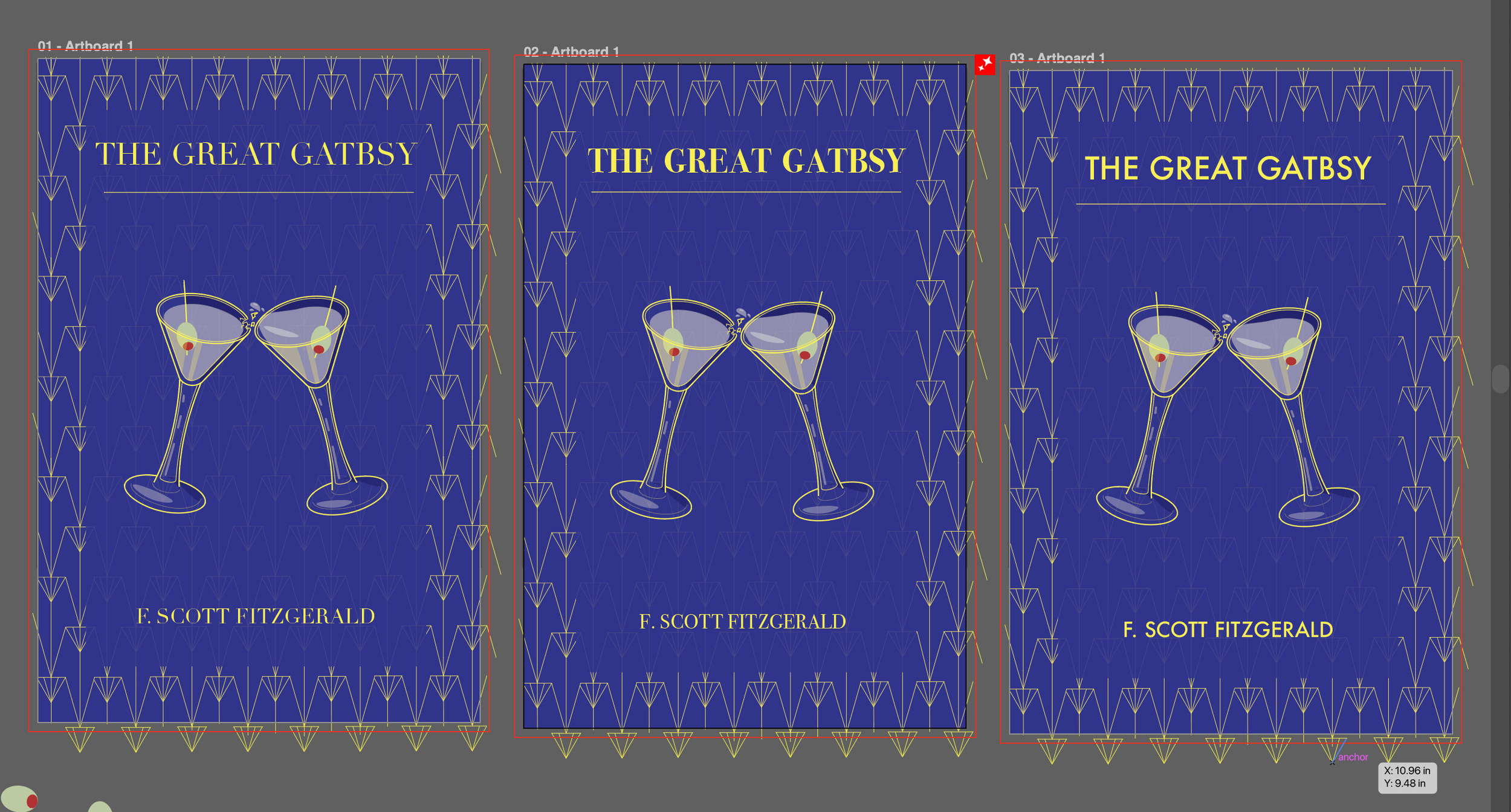
Here are the digital rough sketches of my first three ideas. After creating them into a digital rough sketch, I really enjoyed the idea on the right and the middle idea. I ended up choosing the idea on the right because I could see many ideas flowing through including patterns, colours, and typography.
My Workspace
What I tend to do whenever I am working to create a good rough draft is to work through each part like its own steps.
I worked on making the cocktail glass, deciding on which colours I should use, and so forth.
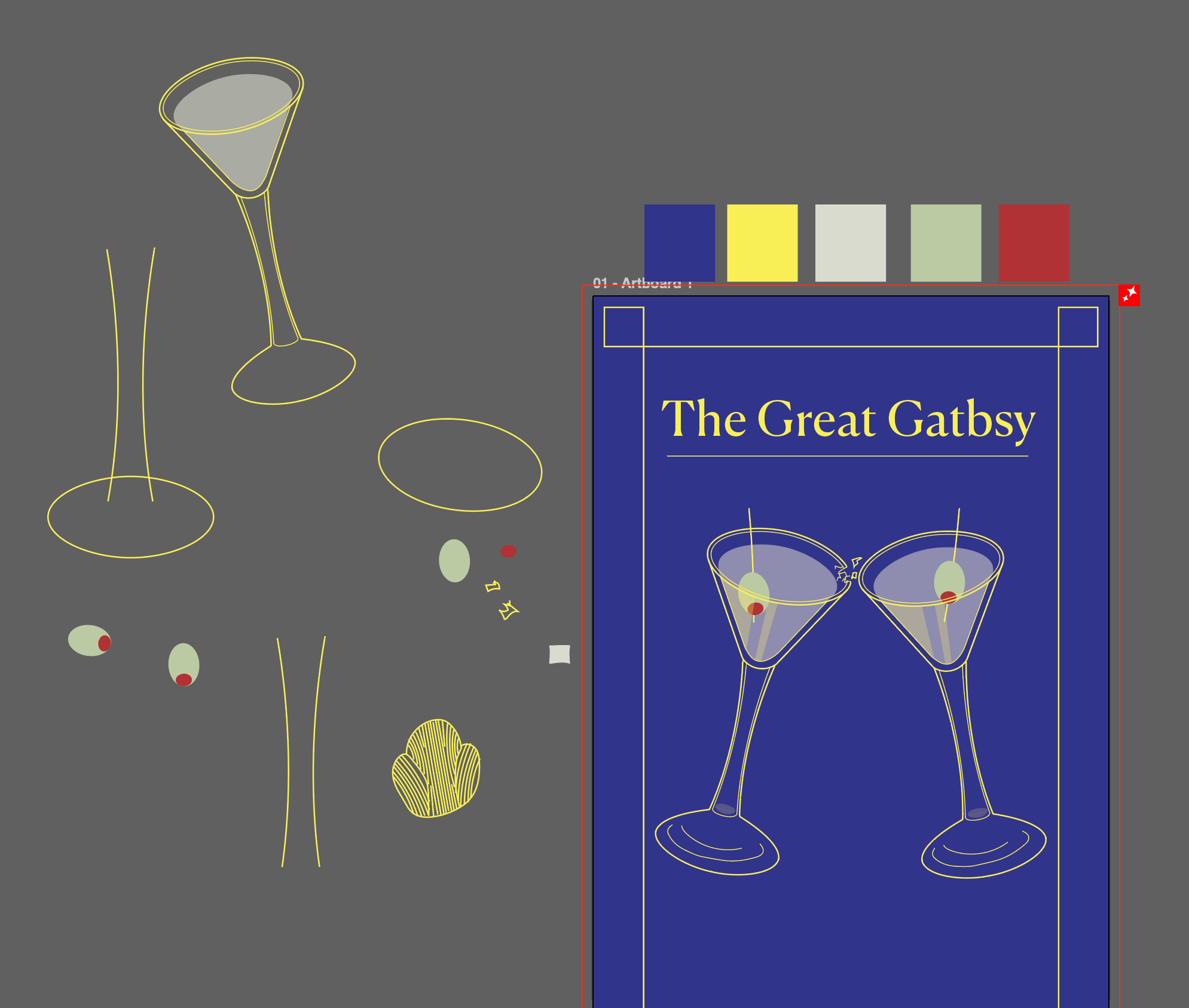
Colours Used
HEX: 2f348f
HEX: fcee21
HEX: d9dacd
HEX: b9cb9f
HEX: be212f
First Rough Draft
The good rough draft copy has an art deco inspired boarder, uses minimal colours, still figuring out the fonts to use, ands details of the cocktail glass cracking.
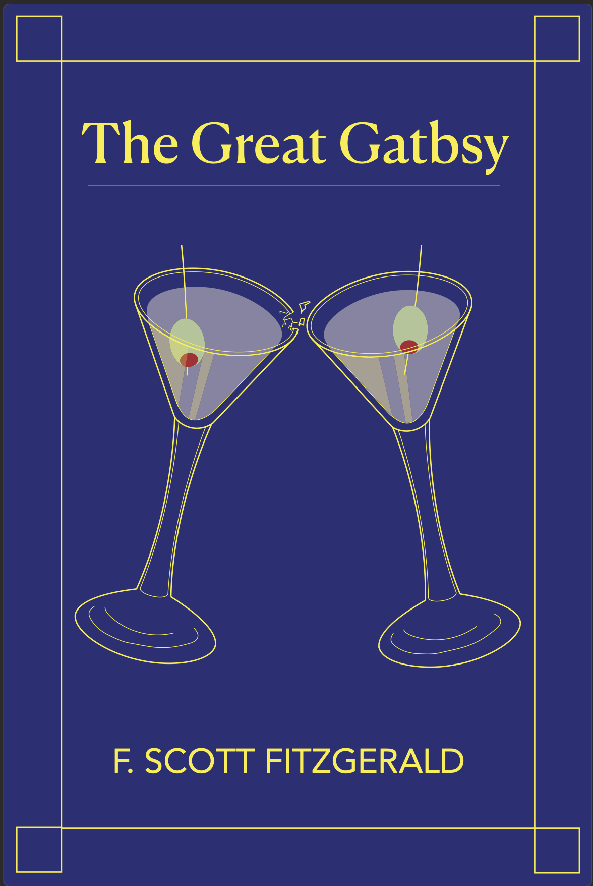
Last Drafts
I made a few changes since the first rough draft after receiving some feedback. I added the art deco-inspired border around the cover, and I added more details on the glasses. It came down to three different fonts to help me decide which font is the most suitable for an action/mystery 1920s book.
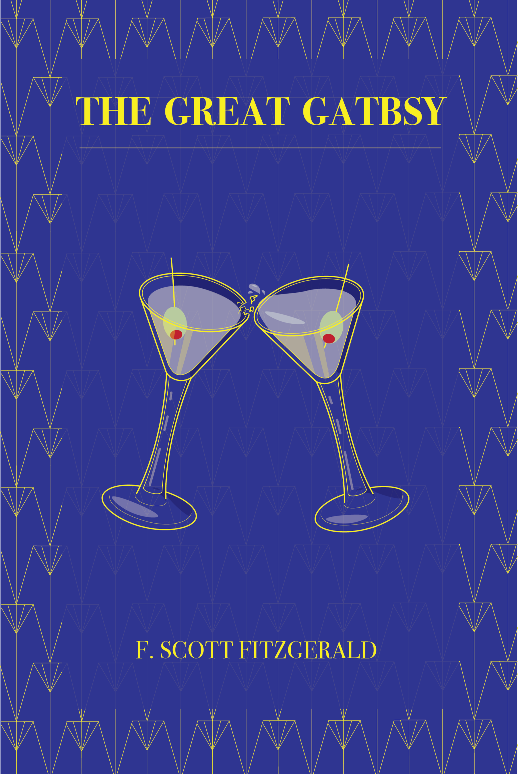
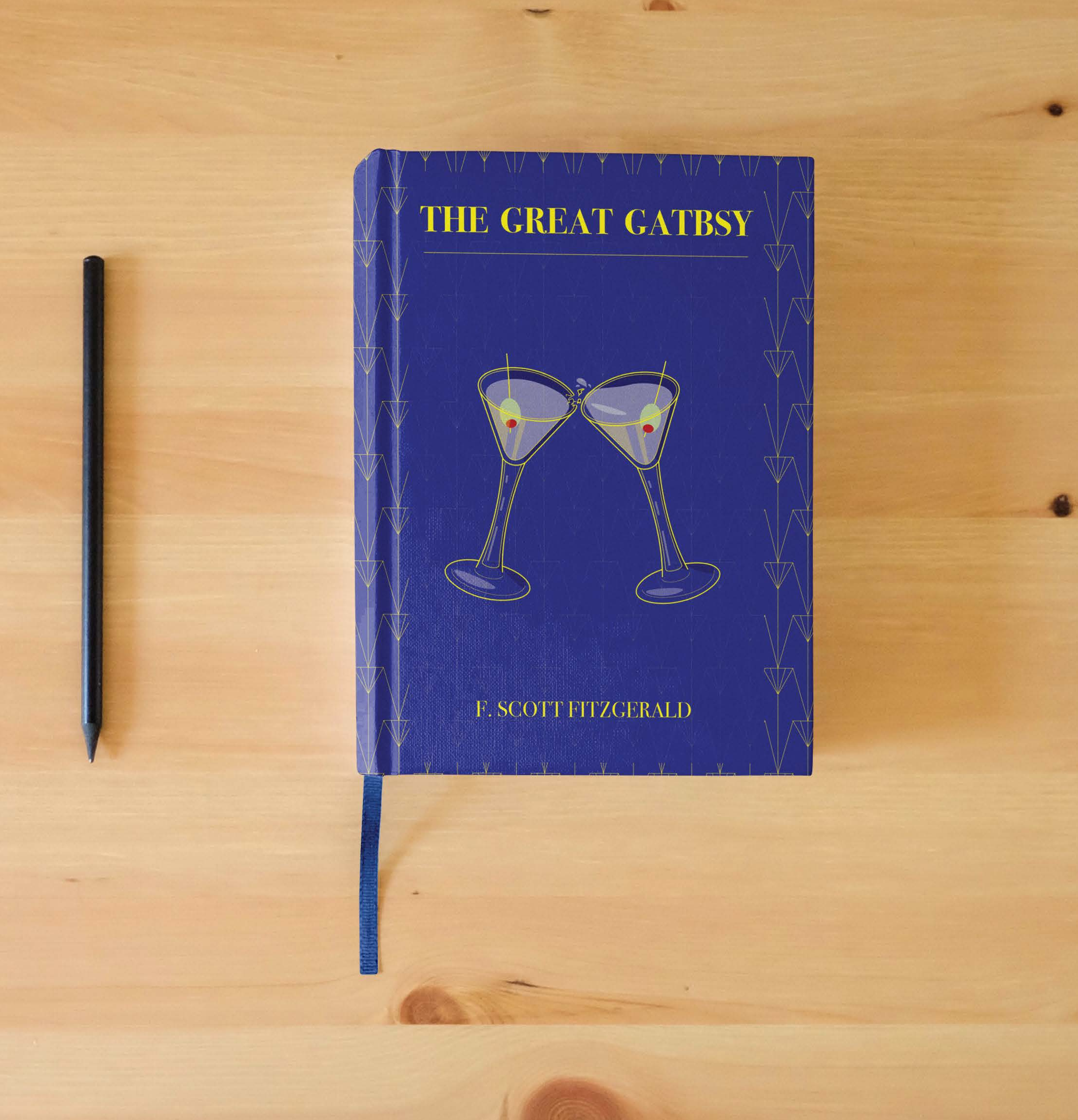
The final copy has minimal changes since the last rough drafts. I made sure the cover had accurate symbolism to represent the strange friendship dynamic between Nick Carraway and Jay Gatsby. The image represents secrets, suspicion, and paranoia concealed by the glamorous life no one questions.
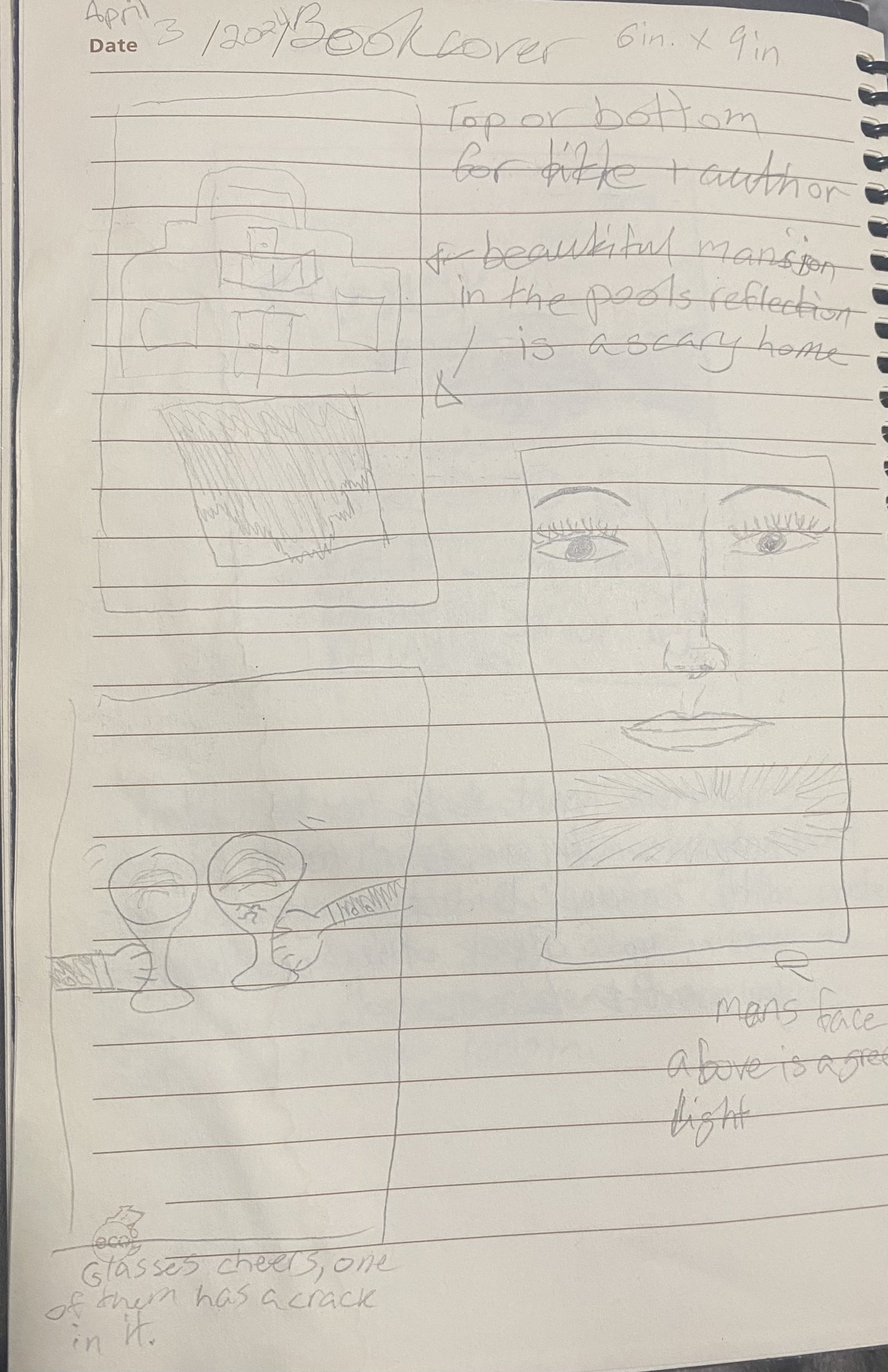
Top Left Sketch
The top-left sketch depicts the home across the lake, with the green light glowing in the dark, a direct reference to the main part of the story.
I considered this illustration because it would have helped readers envision the time period and the lifestyle Jay Gatsby lived.
I didn’t choose this sketch idea because it was too complex for people to understand as they skim through the book, deciding whether they want to purchase and read it or not.
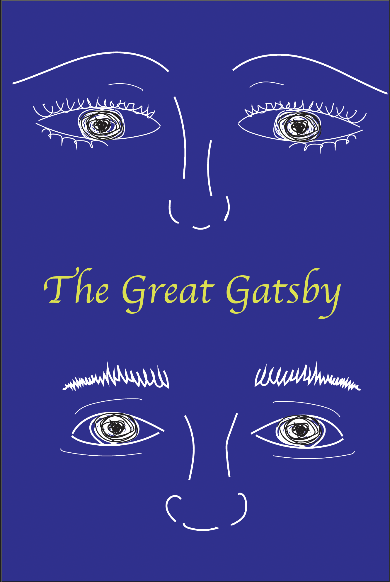
Middle Right Sketch
The middle right sketch illustrates a drawing of Daisy Buchanan on the top, in the middle would be a green glowing light, then Jay Gatsby below.
I would have considered this illustration because it challenged me to draw the faces of two characters set in the 1920s, making sure I got the details and the beauty trends at the time right.
Why I didn’t choose this sketch idea was because it was very similar to one of The Great Gatsby’s book covers. The idea had too many layers for people to keep up with.
Bottom Left Sketch
The middle right sketch illustrates two cocktail glasses cheering a little too hard, where one of the glasses cracks.
I considered this illustration to be the cover because it had a perfect balance of symbolism, foreshadowing, and mystery. Enough to leave the reader interested in finding out about a “shattering” situation.